


Register revamp
Register revamp
Background
Background
Background
The project was initiated after a potential user encountered a bug on the registration page, causing them to abandon the process. This issue highlighted a critical gap in the onboarding journey, directly affecting user acquisition. It became clear that the registration flow needed an immediate redesign to ensure a seamless and reliable experience.
The project was initiated after a potential user encountered a bug on the registration page, causing them to abandon the process. This issue highlighted a critical gap in the onboarding journey, directly affecting user acquisition. It became clear that the registration flow needed an immediate redesign to ensure a seamless and reliable experience.
The project was initiated after a potential user encountered a bug on the registration page, causing them to abandon the process. This issue highlighted a critical gap in the onboarding journey, directly affecting user acquisition. It became clear that the registration flow needed an immediate redesign to ensure a seamless and reliable experience.

Data findings
Data findings
Data findings
Our analysis revealed over 30% drop-off rate on the registration page, highlighting a critical bottleneck in the onboarding process. Additionally, the input OTP page experienced a further 25-30% drop, indicating user frustration and technical barriers that required immediate attention.
Our analysis revealed over 30% drop-off rate on the registration page, highlighting a critical bottleneck in the onboarding process. Additionally, the input OTP page experienced a further 25-30% drop, indicating user frustration and technical barriers that required immediate attention.
Our analysis revealed over 30% drop-off rate on the registration page, highlighting a critical bottleneck in the onboarding process. Additionally, the input OTP page experienced a further 25-30% drop, indicating user frustration and technical barriers that required immediate attention.

Daily potential users lost
Daily potential users lost
Daily potential users lost
~3000 - 7000
~3000 - 7000
~3000 - 7000
Yearly potential users lost
Yearly potential users lost
Yearly potential users lost
~1.095.000 - 2.550.000
~1.095.000 - 2.550.000
~1.095.000 - 2.550.000
Design process
Design process
Design process
We follow proper design process to give the best design solution.
We follow proper design process to give the best design solution.
We follow proper design process to give the best design solution.
Establish requirement
Establish requirement
Establish requirement
Build prototype
Build prototype
Design alternatives
Design alternatives
Design alternatives
Evaluate design
Evaluate design
Evaluate design
Build prototype
Quantitative and qualitative research
Quantitative and qualitative research
Quantitative and qualitative research
With support from the research team, we conducted user testing with 8 participants across various phone screen ratios to identify the issues they encountered. Here are some of the key insights and problems they shared:
With support from the research team, we conducted user testing with 8 participants across various phone screen ratios to identify the issues they encountered. Here are some of the key insights and problems they shared:
With support from the research team, we conducted user testing with 8 participants across various phone screen ratios to identify the issues they encountered. Here are some of the key insights and problems they shared:
User didn’t realize they could scroll to find an additional section.
User didn’t realize they could scroll to find an additional section.
User didn’t realize they could scroll to find an additional section.
User expect one page to registration: There’s too much scrolling involved
User expect one page to registration: There’s too much scrolling involved
User expect one page to registration: There’s too much scrolling involved
Unresponsive checkbox
Unresponsive checkbox
Error indicator is unclear
Error indicator is unclear
Password requirements section text that takes up too much space
Password requirements section text that takes up too much space
Password requirements section text that takes up too much space
The spacing between fields is too wide
OTP not sent
OTP not sent
OTP not sent
The spacing between fields is too wide
The spacing between fields is too wide
Error indicator is unclear
Unresponsive checkbox
These findings highlighted usability and technical issues across different devices that significantly impacted the user experience.
These findings highlighted usability and technical issues across different devices that significantly impacted the user experience.
These findings highlighted usability and technical issues across different devices that significantly impacted the user experience.
Competitor reference
Competitor reference
Competitor reference
I explored the registration processes of several digital banks in Indonesia to gain insights into industry practices. Surprisingly, most competitors require more than three steps/pages to complete registration, making the process lengthy.
I explored the registration processes of several digital banks in Indonesia to gain insights into industry practices. Surprisingly, most competitors require more than three steps/pages to complete registration, making the process lengthy.
I explored the registration processes of several digital banks in Indonesia to gain insights into industry practices. Surprisingly, most competitors require more than three steps/pages to complete registration, making the process lengthy.
This presents an opportunity to differentiate our design by keeping it concise while addressing key issues such as error indicators, spacing, unresponsive checkboxes, and excessive scrolling.
This presents an opportunity to differentiate our design by keeping it concise while addressing key issues such as error indicators, spacing, unresponsive checkboxes, and excessive scrolling.
This presents an opportunity to differentiate our design by keeping it concise while addressing key issues such as error indicators, spacing, unresponsive checkboxes, and excessive scrolling.
Opportunity Solution Tree
Opportunity Solution Tree
Opportunity Solution Tree
Based on insights from users and competitor analysis, I developed an Opportunity Solution Tree to map out the identified problems and potential solutions.
Based on insights from users and competitor analysis, I developed an Opportunity Solution Tree to map out the identified problems and potential solutions.
Based on insights from users and competitor analysis, I developed an Opportunity Solution Tree to map out the identified problems and potential solutions.
The tree outlined key pain points, such as buggy system, unresponsive elements, and poor error handling. For each issue, I proposed solutions to be tested through targeted experiments, ensuring an iterative approach to optimizing the user registration experience.
The tree outlined key pain points, such as buggy system, unresponsive elements, and poor error handling. For each issue, I proposed solutions to be tested through targeted experiments, ensuring an iterative approach to optimizing the user registration experience.
The tree outlined key pain points, such as buggy system, unresponsive elements, and poor error handling. For each issue, I proposed solutions to be tested through targeted experiments, ensuring an iterative approach to optimizing the user registration experience.

User flow
User flow
User flow
The revamped registration flow has been simplified and optimized to improve usability and reduce drop-off rates. The updated flow ensures fewer steps, clear guidance at each stage, and a more user-friendly experience. Below is the complete flowchart illustrating the new registration process:
The revamped registration flow has been simplified and optimized to improve usability and reduce drop-off rates. The updated flow ensures fewer steps, clear guidance at each stage, and a more user-friendly experience. Below is the complete flowchart illustrating the new registration process:
The revamped registration flow has been simplified and optimized to improve usability and reduce drop-off rates. The updated flow ensures fewer steps, clear guidance at each stage, and a more user-friendly experience. Below is the complete flowchart illustrating the new registration process:

UI screens
UI screens
UI screens
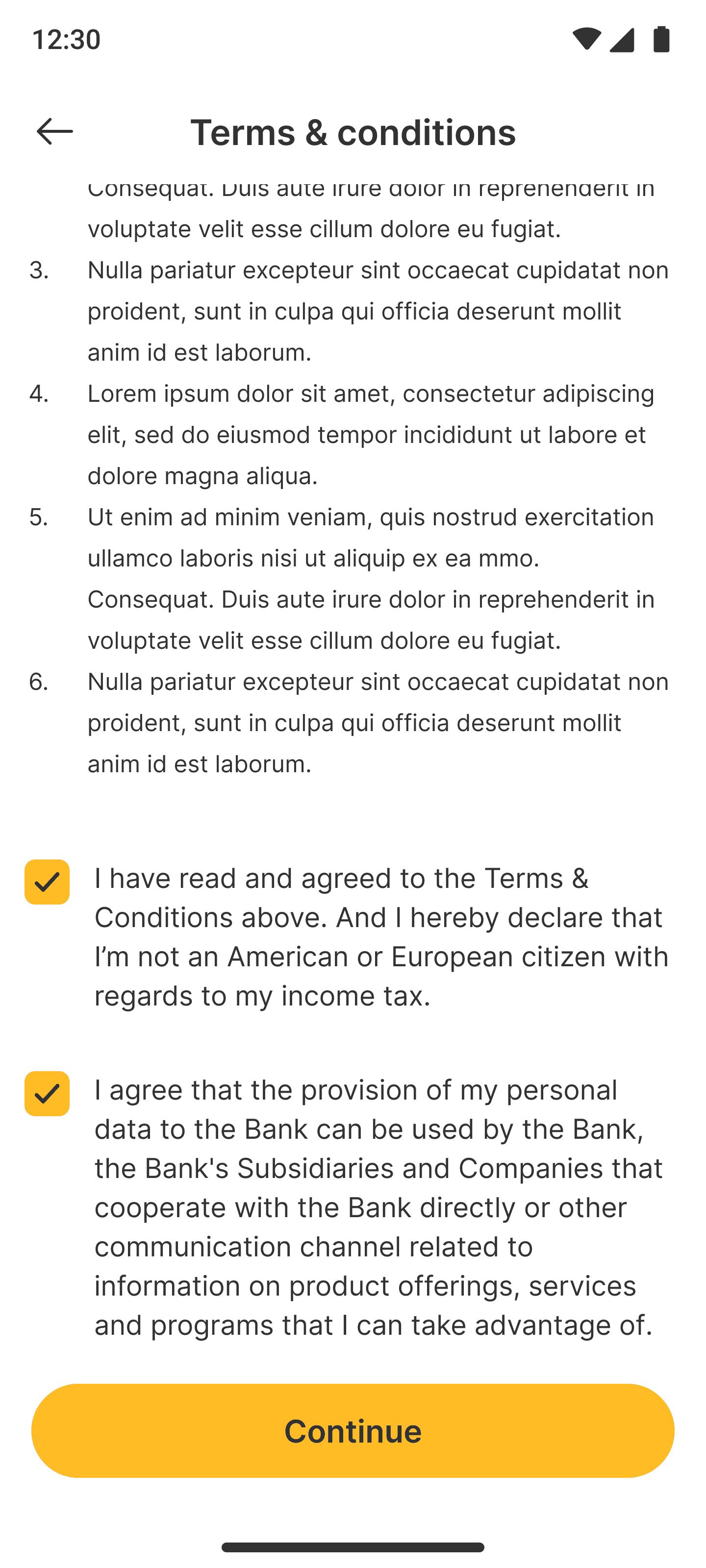
Here are the complete UI screens showcasing the happy flow I’ve designed for the revamped registration process. The screens are optimized to ensure a smooth user experience, addressing key issues such as responsive design, clear error indicators, and minimal scrolling. Each screen is designed to guide the user effortlessly through the registration process, making the journey as seamless as possible.
Here are the complete UI screens showcasing the happy flow I’ve designed for the revamped registration process. The screens are optimized to ensure a smooth user experience, addressing key issues such as responsive design, clear error indicators, and minimal scrolling. Each screen is designed to guide the user effortlessly through the registration process, making the journey as seamless as possible.
Here are the complete UI screens showcasing the happy flow I’ve designed for the revamped registration process. The screens are optimized to ensure a smooth user experience, addressing key issues such as responsive design, clear error indicators, and minimal scrolling. Each screen is designed to guide the user effortlessly through the registration process, making the journey as seamless as possible.
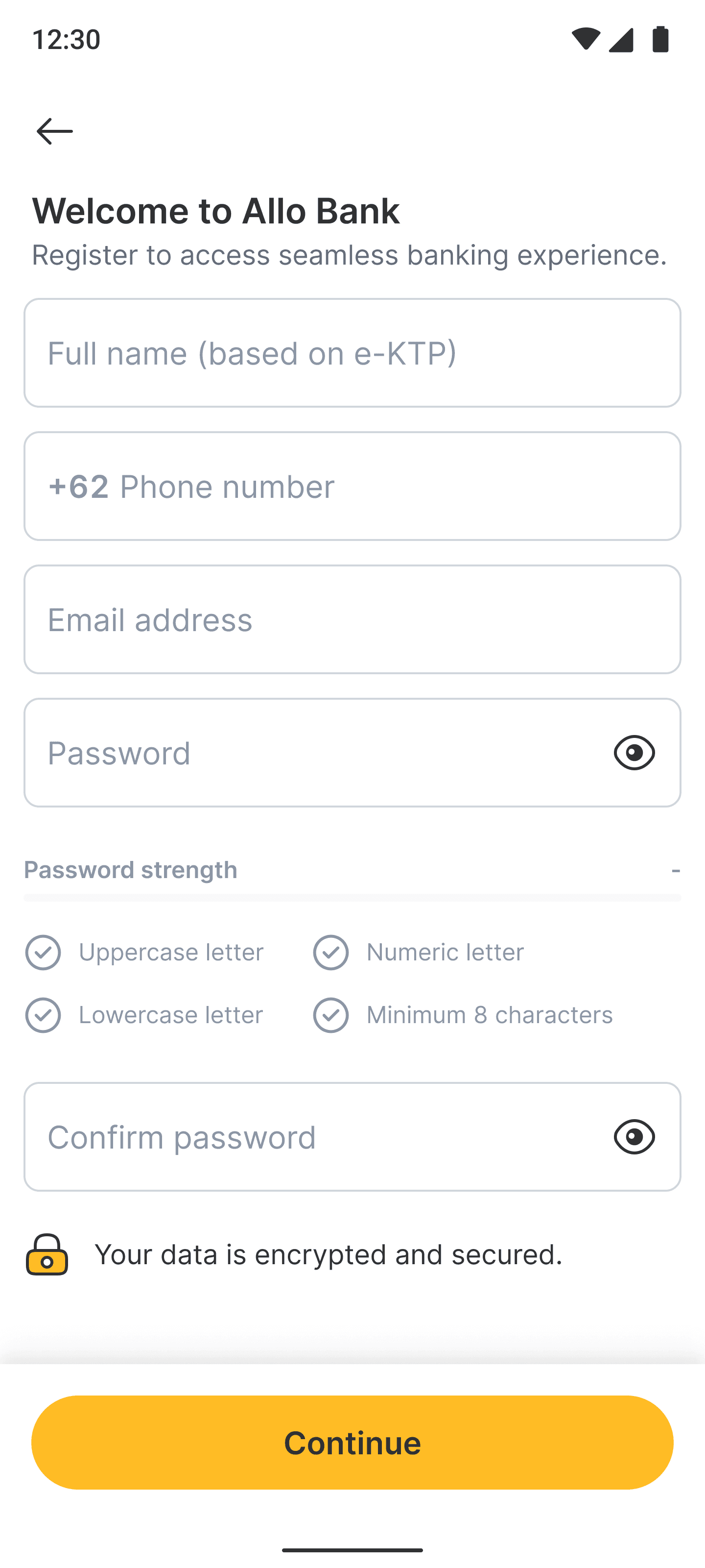
Default

Filled

T&C
T&C mark

OTP

Create PIN

Confirm PIN

Success
Default
Filled
T&C
T&C mark
OTP
Create PIN
Confirm PIN
Success
Lesson learned
Lesson learned
Lesson learned
During the development process, we faced challenges with integrating the revamped registration flow due to inconsistencies in the existing design system. The outdated components and lack of alignment between design and development led to delays and additional revisions. This experience highlighted the importance of maintaining a flexible, up-to-date design system that can support smooth collaboration and ensure consistency across product features.
During the development process, we faced challenges with integrating the revamped registration flow due to inconsistencies in the existing design system. The outdated components and lack of alignment between design and development led to delays and additional revisions. This experience highlighted the importance of maintaining a flexible, up-to-date design system that can support smooth collaboration and ensure consistency across product features.
During the development process, we faced challenges with integrating the revamped registration flow due to inconsistencies in the existing design system. The outdated components and lack of alignment between design and development led to delays and additional revisions. This experience highlighted the importance of maintaining a flexible, up-to-date design system that can support smooth collaboration and ensure consistency across product features.